There is quite a lot to be said for surrounding oneself with creative
people. They provide an energy exchange and an atmosphere in which an irreverent and innovative approach to what has been standardized and
sanctified is understood, encouraged and even admired. Imagine this
reaction to a particular film that was released in 1960 by the
non-creative element: But Monsieur Godard, you don't have any transition shots! Furthermore, you jump ahead in the middle of a take without so much as a cut-away!
Someone once responded to one of my screenplays by saying it was poorly written. I asked what she didn't like about it and she told me the margins weren't the correct width. I smiled realizing I was dealing with someone who was more concerned with the blank spaces surrounding the page than the content written on the page. Literally and conceptually, we weren't anywhere near the same page. Never mind that the feedback I was getting from the major production companies in town was that it was the most entertaining script they'd ever read; one even asked me to autograph the script for them. Anyone giving such importance to the empty white spaces on the page would never have understood what I had written and would have made a dog's breakfast of it had they ever gotten hold of it as a property.
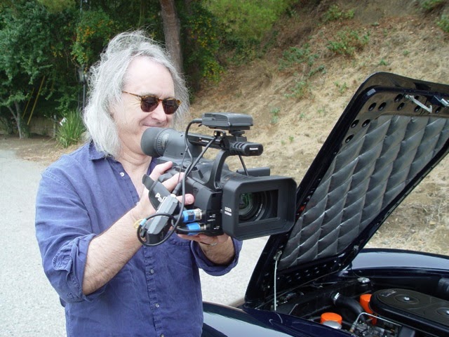
One creative influence on me was an out-of-control young man who I found very entertaining and who went about making videos--short films of all sorts--using a Panasonic S-VHS video camera. His name is Lightfield Lewis and his personality is as distinct as his name. He came from a show business family (his father being Geoffrey and his sisters Juliette and Dierdre) but he seemed completely his own person and was capturing a unique vision of the world with his camera. Lightfield would come to my house and show me his latest footage and I, in turn, would expose him to films like Michelangelo Antonioni's The Passenger.
One thing that caught my attention was a particular feature of Lightfield's camera; it was a Gain Up button that, when activated, altered the video image causing it to look less like video and more like a very grainy film stock that had been colorized in the fashion of Andy Warhol's poster of Marilyn Monroe which Warhol had made from silk screens based on a publicity photo from the film Niagara. I especially liked the evolution of references from digital to silk screen to film icon. I wanted to make use of this effect.
When shooting my web-based soap opera Confessions, I was delivering layers of truth and reality. There was the reality of the confessional booth and for that we used 'straight-ahead' video. Then there was the reality and relative truth of the confessions that were being revealed as flashback and composite shots featuring the in-the-booth reality combined with flashback. I decided to use the 'Lightfield' effect for the flashback and composite shots to differentiate them from the truth of the confessional encounter and to provide a dream-like illusion of the penitent's memory or fabrication.
I think the effect worked very well and gave an unusual visual texture to the program. The video seen here is a poor transfer taken from a VHS copy of the original and has lost some resolution along with much of the color's original vibrancy. I can't look at it without it bringing to mind the whole 'Lightfield, Warhol, Marilyn, Niagara' chain of events.


No comments:
Post a Comment